Friday 31 August 2012

Come Fly With Me...

It's a Blue Moon!  Tonight's Full Moon is the second in the calendar month, so isknown as a blue moon.  So to celebrate the event, here's a blue moon tag, inspired by the blog challenge at Haunted  Design House!

The requirement for the challenge is to include a BIG moon.  So here it is, nice and big and bright, so that Mysti can see where those cheeky bats are...they are due a talking-to and she's just the cat to do it, after a bit of genetic modification, of course....

Update 6/9/12 - I made the Gruesome Twosome!  Whoopee!

Wednesday 29 August 2012

WOYWW - 29 August

Well, my leave is over and it's back to work for me today;  to a new job in a new (temporary) location (our permanent office space isn't ready yet).  It's been a great couple of weeks, I've crafted more than I usually do and I feel nice and relaxed.  I'm counting on the crafting to keep me sane, even if I do have to slow down a bit for a while!

Another reason I'll be blogging a bit less for the next few weeks is because I'm pariticipating in an online course - Andy Skinner's Timeworn Techniques- so most of what I'll be crafting will be practice pieces for the course and not really very interesting to blog!

Anyroad,  it's Wednesday, which means time to hop off around the Blogiverse and have a nosey at everyone's workspace.  Mine is not very inspiring today - I've cleared up a bit.


On the left is the Nestie storage that I was making last week - some of my blog visitors expressed an interest in seeing how it turned out.  Inside it looks something like this -

It works pretty well .  The collection ran to three volumes in the end, plus a number of magnetic folders holding non-nesting dies.  I'm not even mentioning the Sizzix dies!  I am ashamed of myself, I am a die-aholic!  Perhaps I should have a clear-out and offer my unloved dies on Ebay (but I need all of my dies, so perhaps I won't!)

OK, I'm off to Julia's blog and to do some visiting.  Thanks for stopping by!

Tuesday 28 August 2012

Compendium of Curiosities 2 - Challenge 19

This week we are playing with the Kraft Resist techniques from Tim Holtz's Most Excellent book,  A Compendium of Curiosities, Volume 2.   Normally, the rules of the challenge (set by Linda Ledbetter) forbid us to explain the technique but in this particular case Sir Tim himself has put a video on YouTube! so we can all see how it's done!

 
So here's what I've done with the technique -


I've been getting my money's worth out of the Sewing Room Alterations die lately;  this time it's come out a bit Moulin Rouge!  The stamps are by Sam Poole (Creative Expressions).  The sentiment says "Why fit in when you were born to stand out" - I'd like a quesion mark at the end of the sentence but you can't always have everything in this life!

Monday 27 August 2012

The Green Man

Hels Sheridan, queen of the Sunday Stampers Challenge, has ordained that, for this week's challenge, we must create something green - so here we go!
This tag is green in more ways than one.  For one thing, it's cut out of a piece of a cardboard box that some cans came in.  The backing material is a Colour Catcher cloth that came out of the washer a rather pretty shade of blue-green, before I got at it with inks and sprays.  The leaves in the four corners of the tag were cut from the same material.  The rest of the leaves were cut from paper that was coloured with Starburst Stains (LOVE that stuff!)  I cut into the stamped image to attach the leaves and fluffed the leaves up a bit. 

And there he is - The Green Man.  Hope you like it!

(If you want to know more about the Green Man, there's some information here.)

Sunday 26 August 2012

Happy Accidents!

The recipe for Dragons Dreams TIO challenge this time out is -
  • handmade background,
  • interesting character(s),
  • quirky twist.
Here's my interpretation!

This did not start out with the recipe in mind.  In fact, it began as a way of using up some of my, er, "happy accidents".  As you know, Crafters Never Waste Anything.  We are Nature's Recyclers.  And when I managed to get glue on the front of the tag I'd been preparing for another challenge, I didn't throw it away (it was a Inkssentials Kraft tag, after all!)  As I'd started with a background stamp of clock faces, I continued the theme with the sentiment and stamped some more clocks onto the tag.

I'd cut the dress form for another project, but then I'd changed my mind about using it, so after giving it a good rub with some Gilder's Paste (it's much more metallic in real life than the picture shows) I decided to throw that onto the tag.  The chain was also a left-over and I'd made three bronze-gilded flowers for another tag and only used one, so that went on as well.  The wings were in The Box (you know The Box - it's where you keep all the bits that might come in handy.  Mine needs to be the Tardis, though...)  I put them on as well- you know how TIme Flies!

My bag of goodies from Crafty-Emblies included some pocket watches that were just the right size to make the character's face (watch-face - geddit?)  so after a bit of surgery to remove the loop at the top and a quick rub-over with a bit of Gilder's Paste, there it was, job done, and mostly by accident.

Hope you like it! 

Friday 24 August 2012

Caught in Crystal

The recipe for the latest Artful Times blog challenge (sponsored by Oyster Stamps) is to make something using acetate.  I use acetate quite a bit, but usually to "float" things like butterflies over an image, so it took a fair bit of thinking before I remembered the "caught in crystal" technique.


I love the "caught in crystal" technique and have done ever since I saw it in Craft Stamper some years ago. (Sheena Douglass has a tutorial on YouTube here) If you haven't come across it before, a clear-drying medium is spread onto acetate and clear colour and inclusions (e.g. glitter) are added to the medium, then tissue paper is spread over the back of it and the whole shebang is left to dry.  I like to use clear floor polish (Pledge Multi-surface wax - used to be known as Klear) and I keep the pacakaging from the likes of Nestabilities as they have a nice rim which stops the fluid from going everywhere you don't want it to go.

For this piece, I used red and pink drawing inks (the gold backing card makes it look orange).  I also sprayed the acetate with some gold Spray and Sparkle. I attached the acetate to some gold card with the floor polish (it takes a while to dry, but works pretty well and is transparent once dry) and then decorated it with one of my favourite paper flowers and wings moulded from friendly plastic. 

I added the heart, cut out of velvet paper which I'd coloured with my Spectrum Noir pens, and some gold glitter peel-offs to just finish off the topper.  The card was originally white - some Tea Dye DI sorted that out as it was just too stark.

And there you have it.  Hope you enjoyed your visit- you'll be welcome back anytime!

Steampunk Sprockets

If you've glanced at my blog before you've probably noticed that I really, really like Steampunk.  So this week's theme for the Sunday Stampers challenge is right up my street! 

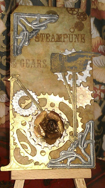
My order from Crafty-Emblies (who are sponsoring this challenge) arrived earlier this week but is still at the stage of "Can't be used, has to be taken out and stroked instead" (My precious!) although I did experiment with a bit of gilder's paste on one of the sprockets (and I am pleased to say that the experiment was successful!) so I fell back on my faithful die cuts and my new favourite Gilder's Paste. 

For once I used the Spellbinders Sprightly Sprockets instead of the Alterations Gadget Gears as I wanted a lighter, less industrial effect.  The corners are from Marianne and the flower is made with the Donna Salazar build-a-rose set.  Everything was covered in Gilder's Paste.

For the background, I cut a stencil out of Doeflex with my Cameo and sprayed Sprinkies ink through it, then proceeded to cover it all up in different shades of Distress.  The words "Gears" and "Steampunk" are my own design (made with the Imagepac system) and the pointing hand is by Tim Holtz. 

Thanks for stopping by - I hope you enjoyed your visit!

Thursday 23 August 2012

Compendium of Curiosities 2, Challenge 18

This week Linda Ledbetter has challenged us to use the Whitewash Stamping technique from Tim Holtz's Compendium of Curiosities Volume II, sponsored by The Funkie Junkie Boutique.

This is actually my second attempt at the technique; version 1 met with a slight accident (I thought I'd put the top back on the tube of glue nice and securely - turns out I was mistaken!)  I used a different stamp and colour palette for the first attempt and snippets of it will probably turn up in future projects.  The stamp I used was a foam stamp designed for home decor.

Sometimes I have a clear idea of how I want a project to look, and sometimes I have no clue of where it will end up.  This was one of the times when I had nothing much in mind.  The background suggested an underwater scene, so I rummaged through my box of bits and found these polymer clay embellishments left over from a previous project.  A bit of gold netting and some Kanban dew drops and there we are!

Wednesday 22 August 2012

WOYWW- 22 August

Happy Wednesday, everyone.  It's that time of the week when we go visiting around the Blogiverse, inspired by Julia.  I'm on week two of my leave (back to work next week- boo) so I've more time for crafting and blogging than usual and I'm having such fun, I can't tell you.
Anyhoo, on my desk (annexe) today, is what is going to be a Nestibilities organiser, an idea borrowed from Kathryn (the Scrapbeach).  I noticed hers while watching her Ustream show about die-cutting (that's at Kathryn Scraps if you want to check it out!) and thought it was just so nifty.  So I've used some chipboard (came as packaging) cut to 9 inches by 6 inches, covered with some paper that I'm probably never going to use for scrapbooking now I've gone digital, and punched with my Cinch.  The magnetic sheet cuts very easily and the E6000 does a very good job of the sticking. 

Once I've done all of the pages, I have to dive back into the haunted wing of my stash and find the binder wires and the Job Will Be Done, apart from embellishing the cover.

OK, I'm off to see what everyone else is up to.  Thanks for stopping by - please call again, I'd love to have you visit!

Tuesday 21 August 2012

Incy-Wincy Spider..


The theme for Simon Says Stamp & Show's blog challenge this week is - Anything Goes. So here's my effort!  The spider is my totem animal, and here sister spider is all glammed up with black glitter ready to rock and roll!
It's amazing what a bit of mica spray can do on black card, isn't it?  The tag was made when I was playing about with the Perfect Pearls mist technique form Tim Holtz's book and I just loved the way it came out.  The roses were made from paper I'd coloured with starburst stains. 

Thanks for stopping by - I hope you enjoyed your visit!

Monday 20 August 2012

Alice and the Caterpillar

You know how some children really latch on to a character from fiction - like Winnie The Pooh or Mickey Mouse?  For me, it was Alice.  I loved Alice from an early age.  I was an early reader and I remember reading the books to myself when I was quite small.  If I could have had everything Alice - like you can get everything Disney these days - I would have.  Never mind Barbie pink, I'd have had everything Alice blue. So of course, when I discovered the Altered Alice's blog challenges, it would have been rude not to participate.

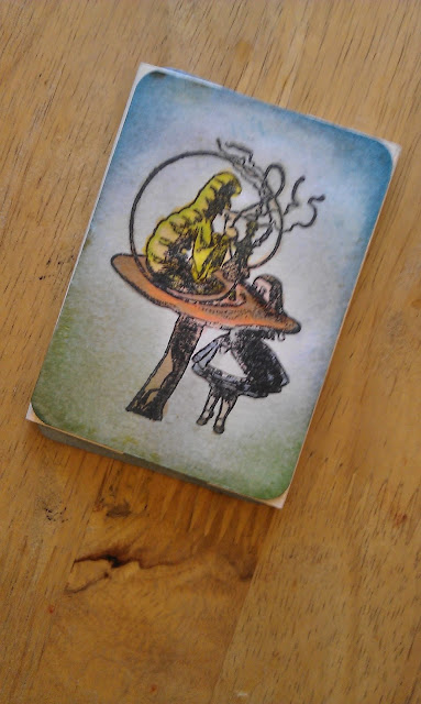
This month's challenge is "Now You See it, Now You Don't" - inspired by the Cheshire Cat. So of course, I based my project on the Caterpillar.  It's a Pushmi-Pullyu card (you can find instructions here - a wonderful resource for all sorts of kinetic cards) made ATC size.  I do love kinetic cards so I really enjoyed this challenge.


The image on the front of the ATC is a Stamp Attack stamp.  The butterfly was a free covermount from the Craft Stamper magazine and I made the sentiment with my Imagepac (now that the sachets are being discontinued I am beginning to get the hang of the process - typical of me!) I coloured the butterfly with Twinkling H2O's and the background with Distress inks.  Alice and the caterpillar were coloured with Promarkers.

Thank you for stopping by - I hope you enjoyed your visit!

Update - I got an Honourable Mention - Yippee!  Thanks, folks!

Friday 17 August 2012

It's all in the technique...

One of the good things about having some time off work is having the time to take part in challenges - I usually have to limit myself to just a few - and when I came across Simon Says Stamp 's  challenge - to make something using your favourite technique - I wanted to give it a try.


My favourite technique?  I love to take a plain piece of paper or card and paint or stain or treat it so that it becomes something much more interesting.  In this case, I've brayered PVA glue over some brown card to make it look like leather,  This card is mostly made from bits and pieces left over from other projects.

I sprayed the back of the card with a little water before I embossed it with an embossing folder to make sure I got a good, deep impression, and as you can see, it took the pattern really well.  The patterned paper on the card is from Joanna Sheen (the Leonardo Da Vinci paper pad).  The sentiment is a digital download from Pink Petticoat.  I think this is a good masculine card  - how about you?


A crown, golden in show


The quote is from John Milton, which makes me look a lot cleverer than I am (we did read some of his poems when I was in school - he wasn't my favourite.  I think my opinion was coloured by his attitude to the women in his life;  in fact he was a real MCP!)
This week Hels has set the theme of "Shiny" for the Sunday Stampers challenge.  I had lots of ideas for shiny things...but none of them included stamping so didn't meet the challenge criteria.  Then I remembered the Flitterglu and the Kanban Steampunk stamps and the Problem Was Solved!

The large crowns were cut with Spellbinders dies.  The tag is actually greener than it looks in the picture, being coloured with Peeled Paint, Pine Needles and Evergreen Bough DI's - the gilding flakes I used were from Crafy Notions (Variegated Green) and I wanted to pick up the green tints. 

Thanks for visiting - I hope you liked the tag.

Thursday 16 August 2012

Playing with Terra

Well, I had a go at making flowers using paper that I'd painted with Viva Terra, and I have to say that I'm rather pleased with how they turned out!  I  left the centre of each flower die-cut unpainted as you can't see that bit when the flower is assembled and it made it easier to glue.  I used hot glue - and built the roses up on the end of a cotton-wool bud (after chopping off the cotton wool - if you leave it on the glue stick to the cotton wool and the whole thing comes off the stick! 

I treated the picture frame (a cheapie from IKEA) with another colours, mixed on the frame with a sponge.

The photo is of Craft Supervisor Mysti when we met her for the first time.  Little did we know, on first acquaintance with this sweet little kitten, that she had a whim of steel!  Her registered name is Bootilicious;  I thought about the visit to the vet and the moment when they call out your pet's name and decided we'd change it.  We toyed with calling her Boadicea, but decided it wouldn't be suitable for such a sweet, gentle little thing.  Boadicea would have been a very good name for her, as it turned out.  I think she looks good in the frame, though.

Thanks for stopping by  - please leave a comment so I can visit you, too!

Wednesday 15 August 2012

WOYWW - 15 August

Good grief, doesn't Wednesday come round fast?  At least this week, I'm not taking sneaky peeks at Julia's blog in my lunch hour.  I've got this week and next off work, and I'm so enjoying having the chance to play with all the techniques I've been waiting for the time to get to grips with, and the tiem to have a really good blog-hop. 

Today, on my workdesk, (annexe) you can see the paper flowers I'm in the process  of painting with Viva Terra paint.  I'm aiming for a terracotta-look rose - I'll keep you informed as to how I get on!  In the background you can see the mini hat I was making a few weeks ago - I'm making a display stand for it.  It's going to be a Red Hat Society hat, which is why it has touches of purple. 

Hope you enjoyed your visit - I'm off to do some visiting myself!

Tuesday 14 August 2012

Mona Lisa Tile

I'm having a really great time on my leave this year.  Not going anywhere much, just pottering about and having time to craft and enter blog challenges, which I don't normally have the time for.  This piece is for the Artful Times blog challenge, as sponored by Oyster Stamps, and the theme is Mona Lisa.

Now, a few years ago you couldn't move without seeing La Giaconda on a rubber stamp but she's gone out of fashion a bit.  So while I was at it, I thought I'd revisit something else I'd not used for a while - Stampbord.  And while rummaging through the haunted wing of my stash, I found some Joanna Sheen Leonardo Da Vinci paper and some very old Kanban alphabets.  A bit of UTEE, a background stamp and a few well-chosen words when I put my thumb in the molten UTEE (Oh bother!)  and here's the result.  UPDATE - I was runner-up in the challenge! Woo-hoo! 

I hope you like it, and thanks for visiting! 

Heavy Metal

The theme for the latest blog challenge from The Stamp Man is "Metal". Hah!  This plays right into my (somewhat inky) hands, because, gentle blogger, my favourite thing of the moment is Gilder's Paste, which is just super at making all sorts of everything look lovely and metallic;  and I when I was playing with the Perfect Pearls mist technique (see Tim Holtz's Compendium of Curiosities Volume II) I made up a few tags and one of them was just right for this project!
 
The sprocket shapes are die-cut out of chipboard and I've just rubbed some of the paste over them.  They are VERY shiny under the camera's flash, as you can see - it's easier to see in this picture, taken without the flash -
The butterfly is stamped onto Fantasy Film and mounted onto some scrap acetate so that it "floats" and the letters are from the "once upon a time" Sizzlets die, cut out of silver card and mounted on foam squares.  The corner piece was meant to be the gnomon on a sundial but was too small and the arrow was also left over from another project. 

Hope you like it - and thanks for visiting!

Monday 13 August 2012

Compendium of Curiosities, Challenge 17

This week Linda Ledbetter  (sponsored by Simon Says Stamp) has challenged us to get creative with Core'dinations card, as demonstrated in Sir Tim of Holtz's most excellent Compendium of Curiosities Volume II.
 I'm currently learning to tango, so it's not hard to guess where the inspiration for this project comes from!

I chose Mustard Seed Core'dinations card and Ripe Persimmon distress ink for this project.  The  silhouette and the "Tango" was cut on the Cameo.  I got a bit clever when embossing the background and double-embossed it so there's a narrow border around the edge of the Mustard Seed oval.  A black border and a turquoise background to help it "pop" visually ...and the job's a good 'un!

Now what will Linda be challengin us to do next week, I wonder? 

The wind was a torrent of darkness...

The wind was a torrent of darkness among the gusty trees,
The moon was a ghostly galleon tossed upon cloudy seas,
The road was a ribbon of moonlight over the purple moor,
And the highwayman came riding—
Riding—riding—
The highwayman came riding, up to the old inn-door...


The Highwayman, by Alfred Noyes

I remember reading that poem when I was in primary school - the line about the moon, in particular, stuck in my head - and it became the inspiration for my contribution to the  Dragon Dreams TIO challenge.

The recipe -

A blue moon (appropriate, as there will be two full moons in August this year!)
A murder of crows
A chill wind

Hope you like it!

Sunday 12 August 2012

Flora and Fauna

Crafty-Emblies are a new company that sell the most scrumptious wooden embellishments.  They have just issued their first ever blog challenge and the theme is - Flora and Fauna.

I love butterflies (who doesn't?) and one of my go-to dies is the butterfly from Quick-Kutz, so I knew it would have to feature in my project.   I had some paper left from my last background-paper-creation marathon (see, I knew the Olympics would get in there somehow!) with Starburst Stains, so that's what I cut the lower layer and the leaves out of.  I attached it to a bit of scrap acetate (packaging - I never throw it away!) so it looked as if it were flying.  If it were to scale, it would be massive, though...Still, this is Art, so I will gloss over that point and move on.

Orange roses are my favourites so I had to make some - I used the Donna Salazar Create-a-Flower dies (Spellbinders).  You can see the technique for making them here- it's one of the easiest and most effective methods for making paper roses I've come across!

The sundial is made from two unwanted CD's and a bit of cardboard tube, painted with Viva Terra paint and a bit of green flock powder for the "grass".  I undercoated the CD's with PVA before I painted them, so there was a good surface for the Terra to cling to.  The dial is a Tim Holtz Alterations die, painted with Viva Ferro paint.  There is a gnomon for the sundial, made from an ornate corner die and gilded with my new favourite Gilder's Paste, but the massive butterfly is in the way a bit!  It all went together with a bit of hot glue, and for once I remembered to wear my gloves and didn't burn myself...I have learned since the time I tried gluing something above head height and the glue dripped down onto my hand...("Oh dear!"  I exclaimed!)

Anyway, thank you for visiting and I hope you like the blog!  See you soon...

Thursday 9 August 2012

Patterns

Hels Sheridan's Sunday Stampers challenge this week is "Patterns", so here's my chance to play with some of the background stamps I've accumulated over the years!  At the moment the harlequin pattern (from the Artistic Stamper) is one of my favourite stamps so it had to be used!  The tapestry pattern is going to be used in another project so it was handy - and you HAVE to have polka dots, it's compulsory. 

It was all starting to look a bit heraldic, so I added some German scrap and some die-cuts.  And then the Love Of My Life said he thought it looked like something out of Hogwarts - I had Gryffindor red, Slytherin green, and Hufflepuff yellow, but I was missing the blue for Ravenclaw - so I coloured the label die-cut in blue.  Some peel-off letters - I know they aren't everyone's cup of tea, but they have their uses - and it was finished.  Hope you like it!

Wednesday 8 August 2012

WOYWW - 8 August

Hello WOYWW friends!  It's that time again, when we all visit crafty blogs across the universe (well, perhaps not the universe...) inspired by Julia via her blog.  Last week I mentioned that I was counting down to two weeks' leave from work...well, this week I've been told that I'm starting a new job when I return!  It's a job I'd wanted and I'm excited about, but it will mean leaving my team, which I'm sad about...

Anyway, as ever, crafting is a good stress-buster.  So here's my workspace (annexe). 

The cabinet card opens up and...

The stamped image (from Magenta) was a reject from last week's Sunday Stampers challenge.  I wanted a more faded edge to the image but didn't take enough ink off the first time.  As you know, Crafters Never Waste Anything so I set it aside until I could find a use for it.  So when I wanted to play with my Gilder's Paste, I decided to make a frame for it.  The dies are Sizzix Alterations Movers and Shapers, (Cabinet card and Cabinet card mini).  I cut two of the big ones (sliced one in half for the doors) and also cut the shape out of the card I was using to cover base card (which is plain grey packing card as thrown out all over the country ) I cut the third as a frame, with the mini die nested into the big one. 

The it was time to play with the Gilder's Paste.  The colour I used is called German Silver, but don't be misled - it's a pale gold colour, not a true silver.  It didn't take long to dry on the card, and once it was I overstamped with Platinum Planet Brilliance ink.

Once it was all dry, it was just a matter of putting it all together and I will probably decorate the door with a bit of something - but for now, I'm happy with it.  Hope you've enjoyed visiting - so now I'm off to see what you've all been up to!

Monday 6 August 2012

Compendium of Curiosities, Challenge 16

This week Linda Ledbetter has challenged us to make use of the Perfect Pearls Mist technique from Tim Holtz's Compendium of Curiosities Vol 2 (which you really should read if you haven't already!)

This tag came out better than I was expecting almost by accident.  To begin with, I embossed a black tag using a folder that I just liked - there was no plan to it.  Then I used Tim's technique to colour it.  I'd just taken delivery of some Kanban dew drops and wanted to play with them, so I stuck them on - with no idea in my head other than to use my new stuff.  It wasn't until after I'd stamped the dragonflies onto Fantasy Film and stuck them on that I thought, "Hang on, it looks like dragonflies flying over water!"

Of course, if anyone asks, that's what I was aiming for.  You won't tell, will you?

Thursday 2 August 2012

Golden Slumbers

"Golden Slumbers kiss your eyes, Smiles awake you when you rise;  Sleep, pretty baby, do not cry, And I will sing a lullaby"

Hands up if you remember the BBC Schools Radio programme "Singing Together"?  As a schoolchild I learned lots of great songs that I've remembered the rest of my life, and when Hels Sheridan set "Gold" as the theme for Sunday Stampers I found my inspiration in one of those songs I learned all those years ago.

I intended to add all sorts of embellishments and sentiments to this but honestly, I like it as it is.  The mother and baby stamp is by Magenta;  because I wanted the faded, vintage look I inked up the stamp in VIntage Photo DI, took some of the ink off the edges with a paper towel,  and then put the tag on top of it and brayered the back.  The harlequin design is a texture mat and I just rolled in onto the tag.  The background is coloured with Butterscotch Adirondack  and you can just see where I rubbed a tiny bit of Rich Gold Gilder's paste around the edges.

While I'm talking about Gilder's Paste, I spent the best part of half an hour trying to open the tin before the Love Of My Life noticed the words"Press here" on the lid...D'Oh!

Wednesday 1 August 2012

WOYWW - 1 August

August already, and praise be, less than two weeks to go before I go on leave.  On plans to go anywhere, you understand, austerity measures being what they are, but two weeks of not having to go to work is enough.  Lots of crafting will be perpetrated, you can bet.

So, it's Wednesday, and time for WOYWW again.  (To find out more about WOYWW, check out Mrs. Dunnit's blog).  This week my workdesk is - well, in a mess, quite honestly, as the result of having a couple of ideas on the go at once.
As you can see, I've cut and coloured some pieces of Grungepaper, in preparation to make my version of Kim Costello's mini hat,as published in last month's Craft Stamper.  Mine is going to be a red hat, in honour of the Red Hat Club gals, a fine body of women.  My first attempt didn't go so well, so I've adapted the pattern a bit...

Centre left, on my glass mat, is my latest discovery - Gilder's Paste.  It is the consistency of, and smells exactly like shoe polish, and goes onto all sorts of stuff - paper, wood,metal - it will go onto plastic as long as the surface is prepared first with some sort of medium or primer.  It dries quickly and comes in lots of colours.  Haven't made much use of it yet, but I have PLANS...

OK, off to dance class now...Cha-cha-cha and Tango tonight...thanks for stopping by!