Monday 29 April 2013

SIlvery Moon

Hi all, welcome to my blog.  Thank you for choosing to spend some time here, I really appreciate having your company.  Today I am sharing a page from my Goddess book, which I began last year.  Today's page - which I am going to enter in the Artistic Stamper Creative Team Challenge Blog ("Texture") is dedicated to Selene, the Moon goddess.


I started with a page from a Kraft board album (from Papermania) and covered it with canvas, which I coloured with Distress Stains in Faded Jeans and Dusty Concord.  Then I sprayed on some Mr Huey's ink (Passport) and Radiant Rain (Pewter) to darken it down.

When it was dry, I spread a nice thick layer of silver Ferro paint over the top left corner, sprayed my swirl stamp (a foam one designed for stamping on walls!) and pressed it into the Ferro to get a good impression.  While everything dried, I moulded a crescent moon from white polymer clay and stamped the word "Selene" onto frosted shrink plastic using Platinum Planet Brilliance ink.  I also used the Brilliance ink to stamp the honeycomb stamp, which I used unmounted, onto the background.

To finish it all off, I highlighted here and there with Pearl  Moon Metallic gilding wax from Creative Expressions (love the turpentine smell!)  And that was it, finished just in time to enter the April Challenge (nothing like leaving it to the last minute, is there?)

Crafty hugs

Keren


Sunday 21 April 2013

The Ghost of Tom

Have you seen the ghost of Tom?
Long white bones with the rest all gone,
Ooh-ooh-ooh-ooh-ooh-ooh-ooh!
Wouldn't it be chilly with no skin on!

 The "Ghost of Tom" has been haunting me lately. In case you don't know, it's a round, in up to four parts, and great fun to sing (especially the ooh-ooh part).

So, as the Macabre Monday challenge from Haunted Design House this time is "Skeletal Remains", I decided to take it as my inspiration.  

At Halloween we got some plastic skeleton decorations and I used silicon putty to make a mould of one of the skulls.  I used this to make a flat-back mould out of Fimo.  (Did you know that you can bake polymer clay in a silicon mould?  I didn't, but it turns out you can.  It takes a little longer but it does mean that you don't distort small pieces taking them out of the mould before they're cooked).  While it was cooking, I die-cut some arches out of chipboard.  I love these Movers &; Shapers arches - I got them as a birthday present.

 I layered them up, using corrugated card from a packing box to add dimension (sturdier and cheaper than foam tape!)


This (and the shape that came from the middle of the frame - the middle sized arch) got a couple of coats of Viva Terra  (in the pale creamy colour) to give it texture, and I gave a piece of black cardstocl a coat of Decoart Fierro (similar to Ferro) to be die-cut with the Iron Gate On the Edge die once dry.

I gave the skull and the chipboard some antiquing with washes of acrylic paint and a bit of dry-brushing and assembled the whole thing, adding a bit of imitation ivy from my stash and the Iron Gate die cut and sticking it all onto a papier mache box.

Finally, I printed out the words and tore them out line by line, stuck them to the sides of the "casket" and blended some Pumice Stone Distress Ink over the top to age them a bit.

Now all I have to do is decide what I'm going to do with the base of the box...decisions,decisons!

Thank you for visiting!

Crafty hugs,

Keren

Friday 19 April 2013

Stella

Hello everyone, thank you for visiting my blog.  A particular thank you to those of you who have chosen to follow me - I appreciate that you have chosen to spend some time with me very much indeed.  This is my contribution to the  Dragon's Dream Tag-it-on challenge.  The recipe is - pink, a face, and fabric, and here's my attempt.


The stamp is by La Blanche, and I've had it quite some time so I don't know if it has a real name - I've called the lady Stella, because of the stars on the fabric.    I stamped it in Wild Plum Archival ink and blended shades of Distress Ink - Worn Lipstick, Victorian Velvet, and Tattered Rose - over the tag.

I found a scrap of tulle embroidered with stars in my stash of fabric scraps and glued it over the top of the tag (I put spots of Cosmic Shimmer glue behind some of the stars)  trimming it so that it didn't cover the face.

And, just for once, I decided that enough was enough. 

Crafty hugs,

Keren

Thursday 18 April 2013

W is for...

Hi all, welcome to my blog.  Today I'm sharing my contribution to the Craft Barn Blog Alpha challenge.  The letter of the moment is "W", with the extra condition that the background must feature circles.


I've chosen "Watch" (as in timepiece) .  The foreground stamps are by Sam Poole, the circles in the background are Tim Holtz (Bitty Grunge).  What else?  I used Sepia archival ink for the watch and the sentiment, Butterscotch Adirondack for the circles (after masking out the watch with a post-it) and Wild Honey Distress Ink blended over the background.  The watch was a bit stark white when I removed the mask so I went over it with some Antique Linen DI to calm it down, and traced the outline with a pale grey Promarker to help it stand out from the background a bit. 

Add in the definition, and that was it! 

Thanks for visiting.

Crafty Hugs,

Keren

Wednesday 17 April 2013

WOYWW - 17 April

Hello, and welcome to my blog for WOYWW, that time of the week when we go visiting to see what everyone's up to via Julia's blog.

This week, once again, I'm not working with paper or card.  (I will be blogging about how last week's pendants turned out - I've been busy making more!)  Here you can see the little photo frame, bought for £1.50, that I've "antiqued" with layers of acrylic paint and am about to give a coat of floor wax. 

The Klear (now sold as Pledge multi-surface wax) is my secret weapon.  I bought it originally to use for the caught in crystal technique but discovered that it has other uses, such as making faux ivory look polished or for getting a nice soft sheen on polymer clay.  I've even used it as an adhesive. 

Anyway, I'm going to blog and run as I'm away to see what you're all up to.  Thanks for stopping by!

Crafty hugs,

Keren

Monday 15 April 2013

The Red Death

Hi everyone, and welcome to my blog.  Today's post is all about my entry for this month's quest at the Quoth the Raven, Nevermore blog, which is a celebration of all things Poe and doesn't do cute (well, neither do I).  The challenge is to choose three elements from a list, and I have chosen - lace, flowers and Edgar Allen Poe.

I've taken my inspiration from Poe's short story, "The Masque of the Red Death", which is set in against the background of a mysterious plague.  To avoid the Red Death, Prince Prospero, together with a thousand of his nobles, shut himself up in one of his abbeys.  After being isolated for some months, the prince gives a masked ball, decorating each of seven rooms in a different colour. In one room, which is decorated in black and red, is a large clock;  every time it strikes the hour, the guests stop their revels, disturbed by the sound.   At midnight, a hooded figure with a terrifying mask, that of a victim of the Red Death, is suddenly noticed by everyone...(dramatic music, flash of lightning, clap of thunder!)


 Confession time.  I wanted to use the tag background for another challenge, but didn't get it finished in time, so I put it to one side and hoped it would come in handy.  It's a fun technique, this one - but you do get covered in glitter.  I covered the tag with some double-sided adhesive sheet, then covered that with a piece of lace and sprinkled on the black glitter.  After I shook off the excess, I removed the lace, then sprinkled on the red glitter.
When I tried the effect of the clock face (from Prima) against the background it needed something to help it stand out against the bling.  I'd been playing with gel medium, mixing it with black gesso and then spreading it over stamps.  Once dry, it can be peeled off and the resulting image can be added to your project.  I'd tried it on the Angel Wings stamp (from Sheena Douglass).  Now, either the stamp was a bit too detailed or I didn't put enough gel medium on but it was very delicate and fiddly to remove, so I'm not sure if I'll try the technique again, but once I'd rubbed some gilding wax onto the finished wings they did look rather good in a "Dark Angel" kind of way and the clock face looked good against them.

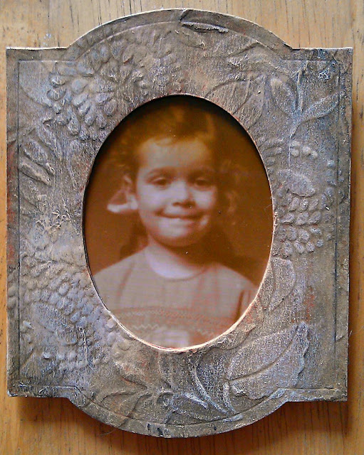
I printed out a picture of Poe, sized to fit an oval pendant blank I had handy.  I covered it in Crackle Accents as I wanted an "aged and distressed" look.  While it was setting, I made three roses using my favourite method and sprayed them with some mica spray.  I had a piece of card that I'd covered with Viva Ferro paint, and I die-cut it with the Fleur-de-Lys On the Edge die in my Vagabond.
After that it was just a question of putting it all together.  I used a couple of foam dots on the back of the pendant as the bail is quite deep, and Pinflair Glue gel for the roses.  Cosmic Shimmer glue worked for everything else, even the clock face, which is made of  metal.

And there it is.  I hope the Master will be pleased with my humble offering;  and that you liked it, as well.  Thank you for visiting - see you soon!

Sunday 14 April 2013

Papillon

Hello everyone and welcome to my little bit of the Blogiverse.  I'm really happy that you've chosen to visit me.  Without further ado, here's today's offering-
I bought some Kroma Crackle medium a while ago and have been trying to get around to using it for some time...and finally did.  I painted this MDF heart (which came in the kit - from Create and Craft - with the Kroma) in pale green, added a splash of pink paint to the Kroma, and dolloped (technical term) the stuff all over the heart, and waited for it to crackle...and waited...and got fed up and took the heat tool to it.

I found out (later) that the Kroma can take up to three days to crackle if left to itself.  If you accelerate the process you get some mighty big cracks (ravines is probably a better word).  And it continues to crackle, so that by the time it was finished, you could hardly see any pink bits at all.  In fact, you'll probably need to click on the picture to get a larger view of it before you can spot it.  Trust me, it is there!


Well, now I have a large sullen lump of mainly green and slightly pink-ish MDF and I'm asking myself what came over me as I don't much like green or pink, so what am I going to do with it?  When in doubt, add Distress!  I blended Peeled Paint DI over the edges and Worn Lipstick and Picked Raspberry over the surface to try and pink up the Kroma a bit, then I sealed it all and thought about what I was going to do next. 

In search of inspiration, I went rummaging through my leftover bits box (all right, it's not just one box.  I'm not saying how many there are.) and found a piece of Tim Holtz Tissue wrap, some paper I'd coloured with mica sprays in shades of blue and lilac, and an Eiffel Tower that I'd cut out with my Cameo for another project and never used.  I don't know why, but the ol' Tour d'Eiffel seemed to work well on the project.  The blue paper reminded me of butterfly wings.


The tissue wrap and the Eiffel Tower went onto the heart with the aid of some Bindex medium (from Pebeo).  I die-cut the lower part of the butterfly (it's an old Quick-Kutz double-cut die and is one of my all-time favourites)  from the paper and the upper part from black card.  I stamped the "Bright Elusive Butterfly" stamp (my own design, made with my Imagepac) onto ordinary tissue paper, tore it out, and stuck it onto the background with the Bindex.  Fast forward through the drying time (actually not too long), during which I layered up some Prima flowers which have been in my stash for a LONG time and stuck the two layers of the butterfly together.

Finally, it was time to stick the flowers and the butterfly onto the base and pretend that it was All Planned From the Beginning. 

I'm entering it into the following challenges -

Country View Crafts - Butterflies
Sunday Stampers - Paint

Thank you for visiting;  I hope you enjoyed!

Crafty Hugs,

Keren

Wednesday 10 April 2013

WOYWW- 10 April

Happy Wednesday, happy WOYWW, and happy birthday to me!  To celebrate, I have booked the day off work so I have some time to craft and blog-hop.  I usually have to fit in a quick post in between coming home from work and heading out again to my dance class ( Waltz and Salsa this week!) so this is a real luxury.  Today I am decorating some pendants with paint effects - the two you can see are ready to have a layer of clear resin to finish them off.  I am liking the effect very much so will definitely make more!

Anyway, I am off to have a nosey at what you've all been up to.  Thank you for visiting, and see you around the Blogiverse!

Crafty Hugs,

Keren

Monday 8 April 2013

Up the Steamstalk!

Hi everyone, thank you for visiting.  Today I am sharing my contribution for SanDee and Amelie's Steampunk challenge, which this month is Fairy Tales into a Steampunk world.  So, without further ado, I present - the Steampunk Beanstalk! 
 
The background was coloured using the same technique as  for Tim Holtz's April tag, so I won't go into details - Tim's done it much better than I ever could, after all.  The rest of it is just die-cuts (Docrafts gears and Spellbinders foliage) and card coloured with Gilder's paste.

Saturday 6 April 2013

What's in the box?

If you've been visiting this blog lately (and thank you for your visit, especially to those of you who have chosen to follow me - I appreciate all of you!) you might have noticed my current obsession with the Alterations Cameo Frame die. (Just in case you haven't, this is the kind of thing I've been making)-

Back in the day, having your photo taken was a big event, and the photos would often be displayed in rather grand cabinets, so to follow the theme through I've made a little "cabinet" for my frames.

I made the box and the frames out of some chipboard, recycled from the sheets that come in the big boxes of envelopes we use in the office ),  (the construction is similar to that for the Steampunk Carriage Clock - see here for details) covered with "leather effect" card - brown card which I'd coated with gloss gel medium, brayered over the whole sheet. The brayered gel leaves a lovely "grained", leathery texture.  The filigree panels I cut on my Silhouette Cameo and gilded with Gilder's Paste ( in real life they're a lot brighter and look metallic).  The handles are Sam Browne belt studs (from a well-known auction website- I found plenty of choice by searching for Sam Brown studs, useful if you have trouble getting hold of Tim Holtz's hitch fasteners).  The hinges also came from that same auction site (try looking for jewellery box hinges or fittings) held on with tiny brads.


Inside, the frame fits snugly - I cut the frame shape three times out of chipboard - this time I wanted the negative space.  I  layered them so that I had a frame that was the right size to fit my box, then covered  the shape with a scrap of brown velour fabric left over from a dressmaking project, before sticking it into place.  I lined the doors with some Art Nouveau paper, and painted a couple of scraps of polystyrene with brown acrylic and stuck them inside the box to act as stops for the doors.  
 
And that was it, job done.  I'm entering this in the Try it on Tuesday challenge - Recycling.
 
Thank you for taking time to visit, and you're welcome back at any time.  See you soon!

Hugs,

Keren

Thursday 4 April 2013

Tim's 12 Tags-April

Ok, confession time again.  I haven't bought any Distress Paints.  Everyone tells me how great they are, but I honestly can't see my way to buying in more paints.  I have a lot of paints already.  So my reproduction of Tim Holtz's 12 Tags of 2013 is another exercise in substitution.

I followed Tim's technique using paints I already have - the metallic paint is from Eco-green.  It worked pretty well - although, of course, the colours are different. 
What else?  Well, the numbers and gears are die-cut from card, the dragonfly stamp is from the Stamp Man (the blueprint in the background is a Tim Holtz one from the Steampunk set), there's a bit of tissue tape on there...

Anyway, it's April and I've kept up so far!  Will I make it to the end of the year?  Tune in next month to find out!

Ta-ta for now!

Hugs,

Keren

Wednesday 3 April 2013

WOYWW - 3 April

;Hi everyone and a happy Wednesday to you all! It's time to go whizzing around the Blogiverse seeing what everyone's up to, courtesy of WOYWW and Julia Dunnit.

Today my workspace is featuring my almost-completed Tim Holtz tag for April and an assortment of bits and bobs, my favourite craft knife (I got used to using a Stanley knife in my youth and never feel really comfortable with anything else) and my Bambi stapler.
Off to the left, you can see a little papier mache box in the shape of a book that I am working on for the altered book workshop I'm doing at the moment.   And that's it.  I'm off to see what you are up to now!  Thank you for calling, and hope to see you again sometime!

Tuesday 2 April 2013

Long ago...

Another of the Cameo Frames I love so much!  This time, the photo is of my husband's grandmother and great-grandmother, probably taken around 1916.  I went to see "Oz, the Great and Powerful" last week, and was inspired by the China girl to try for a cracked ceramic effect, which was what I was aiming for here, and it's my entry for the "Vintage" challenge at the "Allsorts" challenge blog.

I used the reverse side of Centura Pearl card, embossed with a Cuttlebug folder,  as I wanted it to be smooth, and used warmer colours for the washes.  A couple of coats of UTEE to get the glazed effect, then into the freezer it went for 20 minutes or so so that I could get the UTEE to crack.  I rubbed it all over with Walnut Stain Distress Stain to antique the cracks.  Once I'd wiped off the excess I was very happy with the result.

Now, when Great-Grandma had this photo taken, having your picture taken was a very big deal, and pictures were displayed proudly in cabinets, so that's what I'm making next! 

Thanks for visiting, and I hoped you enjoyed your visit - feel free to come back any time!

Monday 1 April 2013

R is for..

Well, I've managed to keep up with the Craft Barn's Alpha challenge so far- much to my surprise!  This time we're asked to illustrate the letter R.  I had to think about this one - what would I choose?  Red?  Rings? Rose?  Well, in the end I plumped for -
RUST!


I learned techniques that I used to make the rust effects in Andy Skinner's Timeworn Techniques online workshop, so I'm not going to go into details as to how I did it - I highly recommend that you sign up if you can afford the modest course fee, though - I've been amazed at the things I've learned how to do!  Suffice it to say that I've signed up for two further workshops and have got my eye on another one...I'm Andy-addicted!

Anyway, thank you for stopping by  - I do hope you enjoyed your visit!


A Cameo Appearance!

I knew as soon as I saw the Tim Holtz Alterations Cameo Frame that it was going to be one of my favourites.  There's just something about the shape that says "days of Yore".  And the movers and shapers ovals work so well within the shape...I just LOVE it! 

So, I've been playing.  I started by embossing some Kraft card (some packaging material, as a matter of fact) with an embossing folder, then once I'd die cut the frame I gave it an undercoat of off-white acrylic paint.  (I was aiming for a ceramic effect, but it didn't work out that way!) I love this embossing folder - it's got a real William Morris feel about it, and I do so like William Morris...
Add caption
Once it was dry, I gave it a few layers of very well-watered paint to antique it, dry brushed  the highlights, and repeated until I was happy with the effect.   (In real life, it's a warmer colour than it looks in the photo.) The Kraft card I'd started with gave it a texture that was a bit like wood, so  I abandoned the idea of making it look like ceramic and gave it a couple of coats of Klear floor wax (now called Pledge Multi-Surface wax).  It doesn't really show in the photo, but the Klear gives it a lovely satin finish.  I die- cut a piece of chipboard for the backing, and glued a strut from the same material to the back of it.  Once I added the photo and glued it all together, the job was done!   
 
So -as I was inspired by William Morris to put this together, I will enter it into the "Inspired By" challenge at the  Anything But A Card Blog challenge.

(The photo is of  me, aged three.  I'm wearing a dress my sister made for me, and strangely enough, I remember it- it was turquoise blue cotton, and she did the smocking on it herself.   Isn't it funny how some things stay with you? )
Anyway, I will be making more of these little frames and will show them to you as they're done. I do hope you enjoyed your visit here - thank you for stopping by, and please do call again!